AI has been the talk of the tech world for the last few years and over the course of 2023/24 we’ve seen it accelerate heavily into the mainstream. It’s even started becoming standard on some products to have AI embedded in it, such as the Samsung Galaxy S24 phone.
My colleague James Reeve made an interesting observation recently, people think AI can do anything. It seems to be an assumption that if you need a logo or a written bit of content or some clever analysis then just hand it over to AI and it will all magically work. But the reality is that AI isn’t all things to all people, but it can work well for specific tasks. I’m sure in the near future those tasks will grow exponentially but this article will focus on the here and now.
So this review is on how the AI chat interfaces are currently looking and behaving, to see what can be learnt from the experience and visuals thus far. It’s a rapidly evolving area and to prove my point Google has rebranded Bard to Gemini, in the time it took me to write this article.
I’ve broken the research into three areas:
I’ll review the above sections through the lens of a User Experience Audit to garner how people are interacting with the technology whilst seeing what improvements could be made to enhance the experience. Things that will be taken into consideration are the usability, aesthetics, messaging and tone of voice.
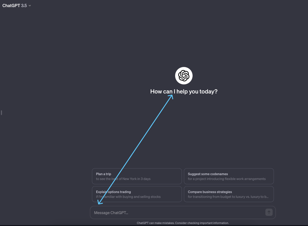
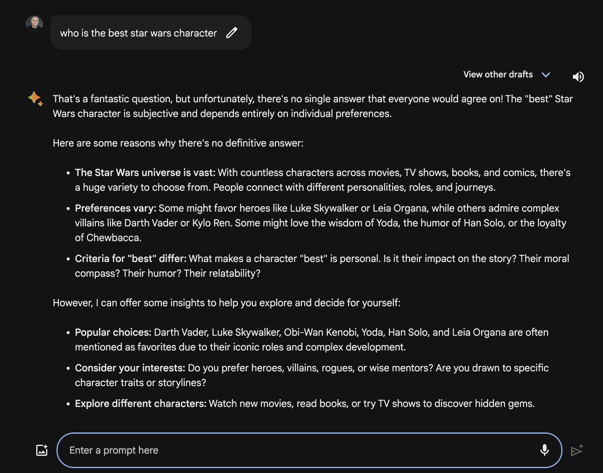
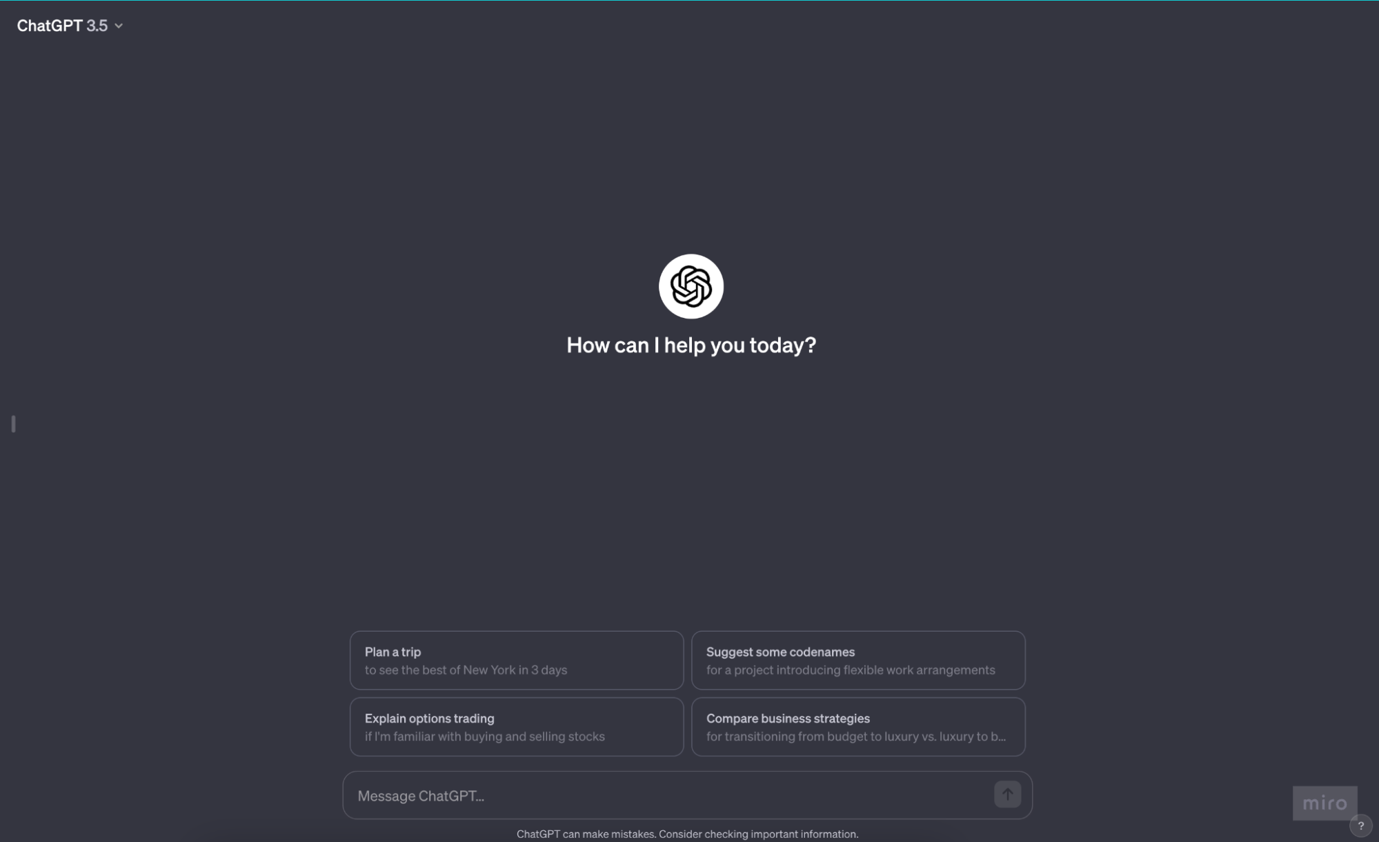 ChatGPT starts off with a disarming message “How can I help you today?”. I find this an odd introduction as the name of the product has the word ‘Chat’ in it which implies that this is a conversational tool, but the phrasing “How can I help you today?” infers that this is a tool to provide you a service reminding me of tools such as ‘Ask Jeeves’*.
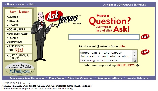
*Ask Jeeves 1999
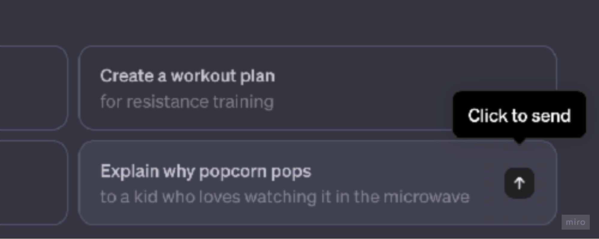
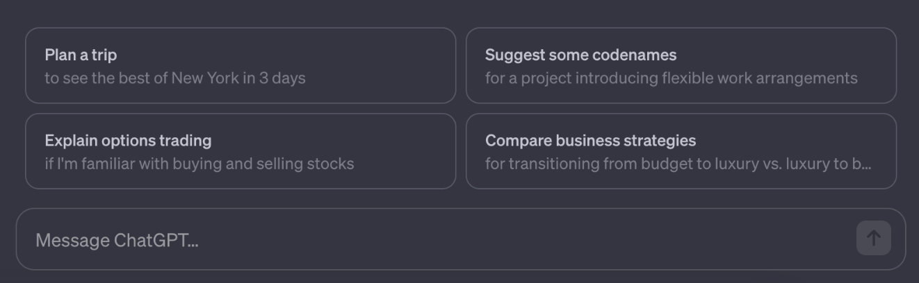
Looking at the microcopy in more detail I find the phrasing a little confusing. If you hover over one of the text cards you reveal an up arrow with the words ‘Click to send’.
Having to explain something that should need no explanation comes across as awkward and it confuses what is actually happening. ‘Click’ is an intuitive action that will occur so seems a needless piece of text, but ‘…to send’ leaves the user to think ‘Where am I sending this? What will happen next? Who will see this?’. It seems that a simple tweak in the microcopy such as “Let’s talk about…’ would lead the user into a conversation, rather than the current transactional feeling.
*ChatGPT January 2024
Sticking with the content theme, the strapline to ChatGPT is “How can I help you today?”. Using an “I” in the strpaline implies that we should regard ChatGPT as something or someone that we can communicate with at a personal level.
The next input field on the site is “Message ChatGPT…”, so they’ve moved from first person to a third person point of view, I find this tension unnecessary. It would make more sense to stick with one persona, is ChatGPT an individual or a tool we get information from?
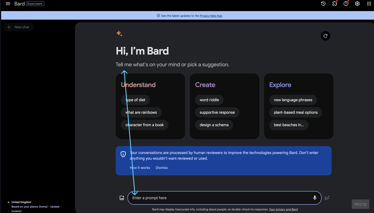
Reviewing Googles Bard, we have a similar quandary “Hi, I’m Bard” says the perky strapline, “Tell me what’s on your mind..”
but the next field we should engage with says “Enter a promp here”.
There’s a real disconnect between the perky intro versus the actual interaction. Imagine meeting someone for the first time and they say ‘What’s on your mind?’ and when you are thinking of what to say, they then say ‘Please give me a prompt’. It’s odd to go from one tone to another.
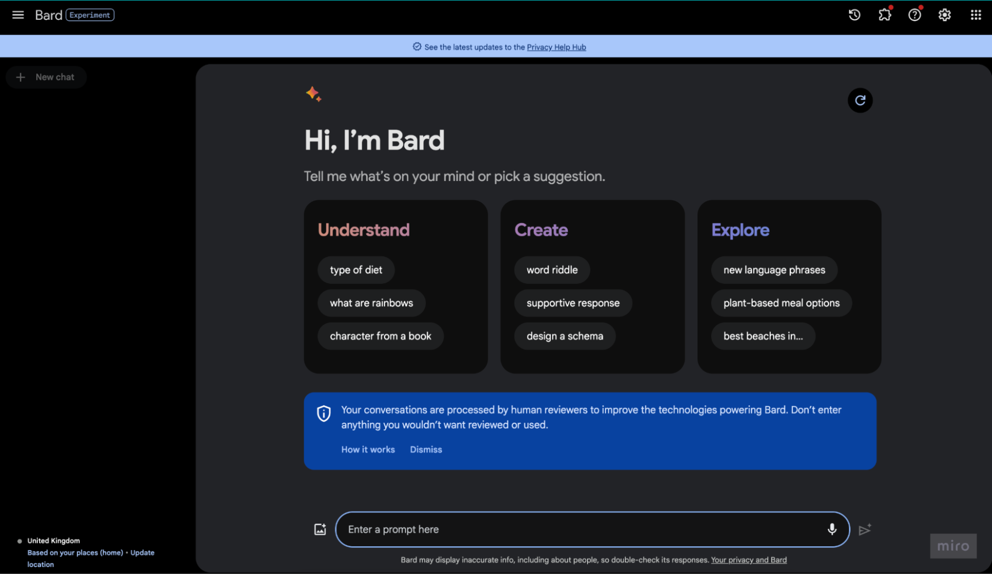
*Googles Bard December 2023
The word ‘prompt’ feels retro (at least to me) like the days of using MS-DOS Prompt in windows and whilst this is OK for the developers of the world and the early adopters I wonder if more technical phrasing rather than conversational will dissuade the less tech savvy of the population from using the products.

*Windows 95 MS-Dos Prompt
Or maybe it will get so much use that asking for prompts will become the norm. We can see many examples in places like Instagram and youtube generously giving their prompts away that they’ve used within MidJourney for example. In fact as of todays date there’s well over half a million hashtags devoted to #prompts already in Instagram.
From a visual perspective the distance between the introductory text and the input field seems too far removed for both ChatGPT and Google Bard.
 *ChatGPT Jan 2024
 *Google Bard Dec 2023
I’d assume the hierarchy of importance should be the introductory copy and then the input field to allow the user the quickest and most obvious route in to start the dialogue with the AI. But in both cases they dissacociate the messaging with the user interaction and thus dilute the connection between user and AI. I think it would be much more practical to raise the importance of the input field so that the user can interact with the AI intuitively, rather than having to scan the page to work out where they can start the dialogue.
With ChatGPT they reduce the importance of the input field even further by styling it the same as the text cards sitting above it.
*ChatGPT input field feels too muted.
Even the text has been muted to be feel less important than the text cards above it.
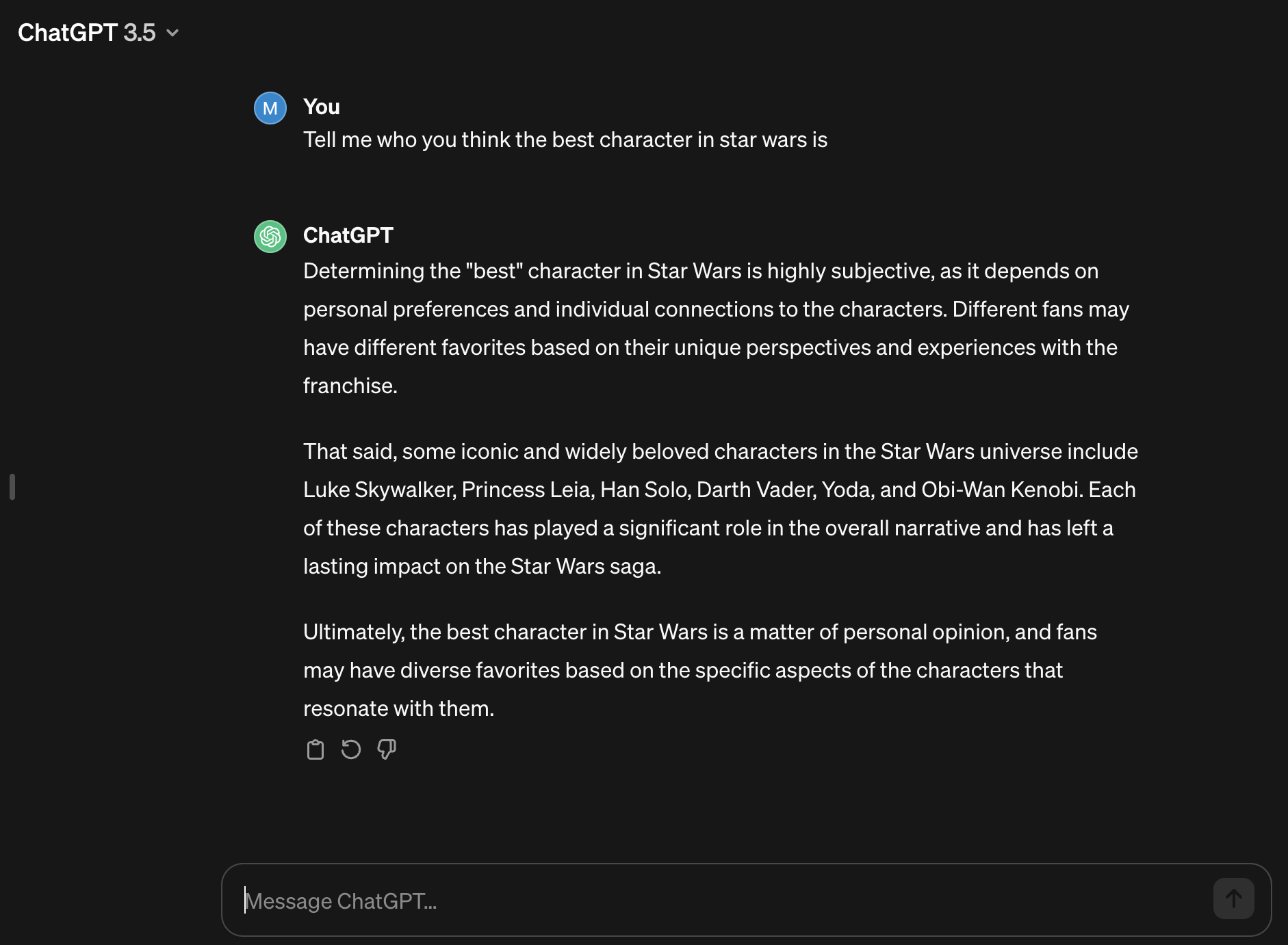
When you ask ChatGPT a question the message within the input field doesn’t change, it remains with “Message ChatGPT…” this leaves the user to assume that they’re not in a conversation but that now they have the response the interaction is over and they need to start a new message.
 Google Bard works in exactly the same way, it keeps with it’s copy “Enter a prompt here” the tone couldn’t feel further away from a normal conversation. I think it would be useful for the user to be able to see an option to carry the conversation on and interrogate the answer in more detail. Why not have two options for instance one to carry on the conversation (as this is actually how it feels when you delve into these AI chats) or to start a new unrelated conversation.
 In the below mockup I’ve pushed the messages closer to the input field to improve the connection between user and AI, I’ve also tweaked the microcopy to “Type a response” leaving no ambiguity that you can respond to the message given by AI. I’ve also introduced a button to start a new chat to infer that if you have all the information you need from this chat then go ahead and start a new conversation.
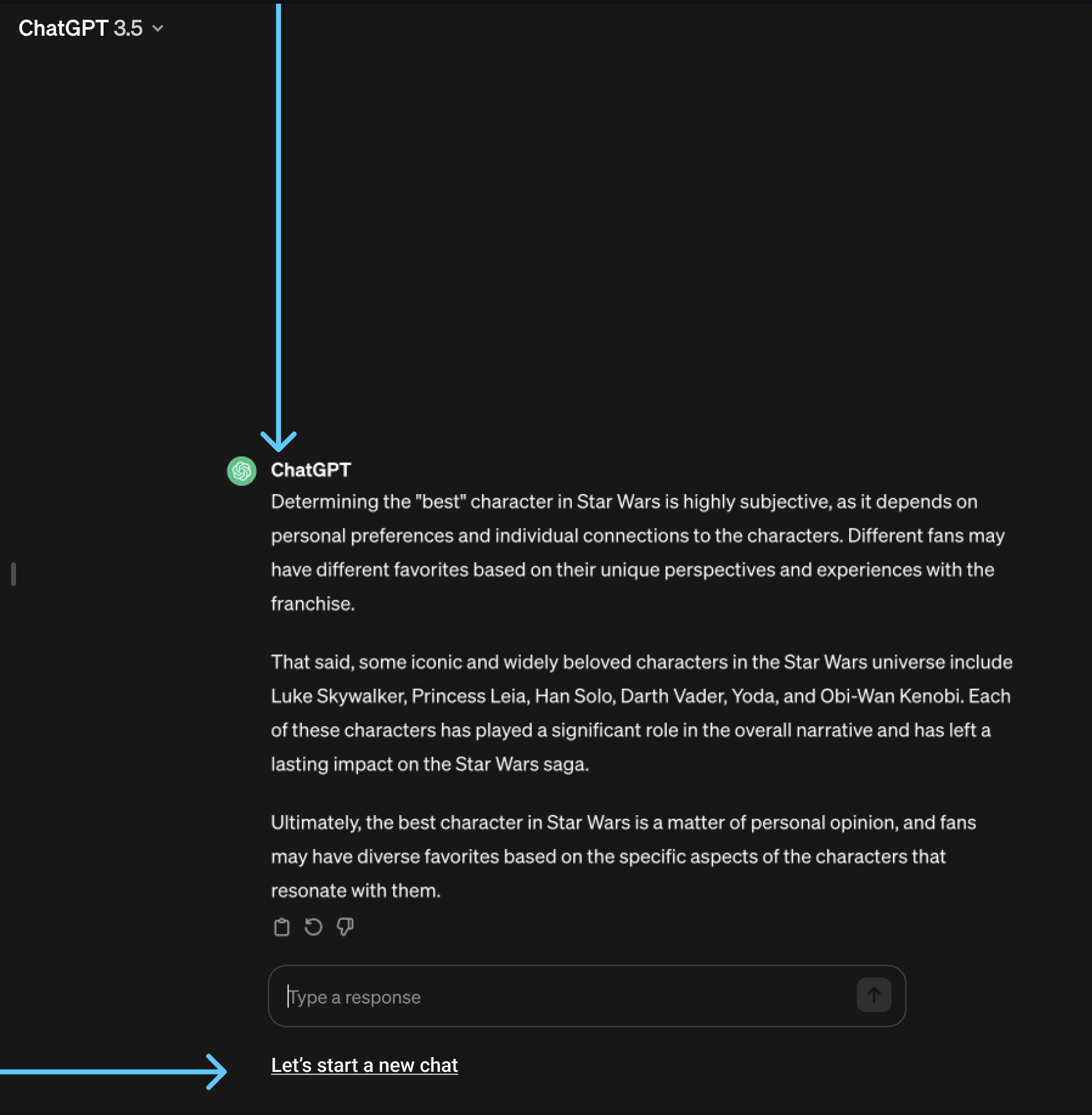
*Mock up to tweak the ChatGPT UI to enhance the UX.
For mass adoption of users to AI messaging products I think there are some learnings to take from the earliest of the digital messaging tools.
MSN messenger came out in 1999 some 24 years ago. One of the reasons for the success was just how easy this was to use. There were no distractions between you and the message, the space between all parties was tight which gave a sense of connection. There’s nothing inbetween the conversation and the the messaging area to impede this flow.
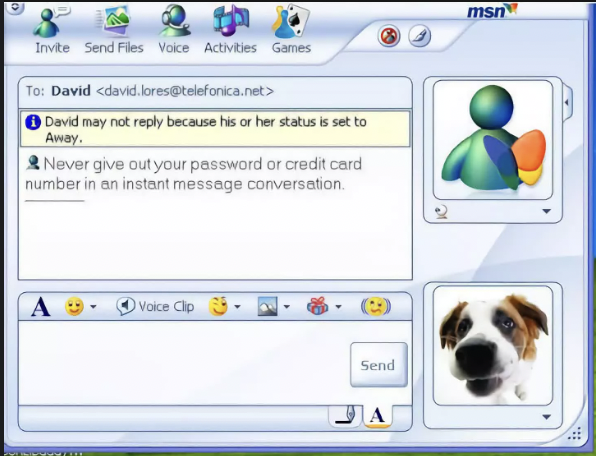
*MSN Messenger 1999
It also displayed clear ways to enhance the conversation by adding elements such as emojis and imagery. You also have the option to tailor the styling to personalise the message. It would be an interesting concept for the conversation to have a certain tone, i.e. you found something funny or annoying and could relay that back to the AI with a visual style rather than typing out your emotion at that time.
The power of AI is astonishing and to bring it to the masses I feel all it would take is a few simple tweaks to allow users at all tech levels to recoup the benefits.
Midjourney within Discord seems to be the champion of the stereotypical tone of a developer driven product.
Forward slashes are the gateway to creation and prompts allow you to paint with words.
As a creative myself I’ve been dumbfounded with the power, speed and quality of Midjourney (and all the other superlatives I could throw at it).
But when first using the product I had never felt so out of my comfort zone. It’s like social messaging on steroids fighting for attention whilst you try and squeeze out some inspiration, from a merciless crowd. Imagine trying to create a painting on the London underground in rush hour and you’ll have a sense of the chaotic and claustrophobic feel of your first time using Midjourney.
*Midjourney step 1 – January 2024
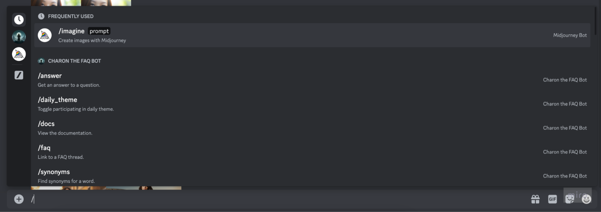
Click into an input field and type “/’.
*Step 2 – January 2024
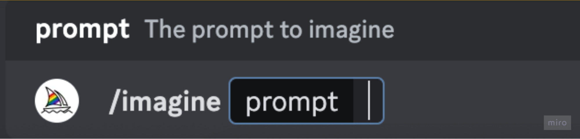
You then need to follow up with “/” with the word “imagine” so you’ve typed /imagine.
*Step 2 – January 2024

This allows you to add your prompts. Doing this feels so techy and unintuitive. I wonder how many people gave up after trying to work through these irregular steps for the newcomers of the product.
I’m sure there are some very logical reasons why it has to be structure like this, but the amount of steps needed for creation: “/” + “imagine” + “prompts” seems like overkill.
When you do find your image you have some fantastic options to modify the image. It isn’t obvious what these buttons do and it seems a simple tooltip would give the user all they need to know to make the decision.
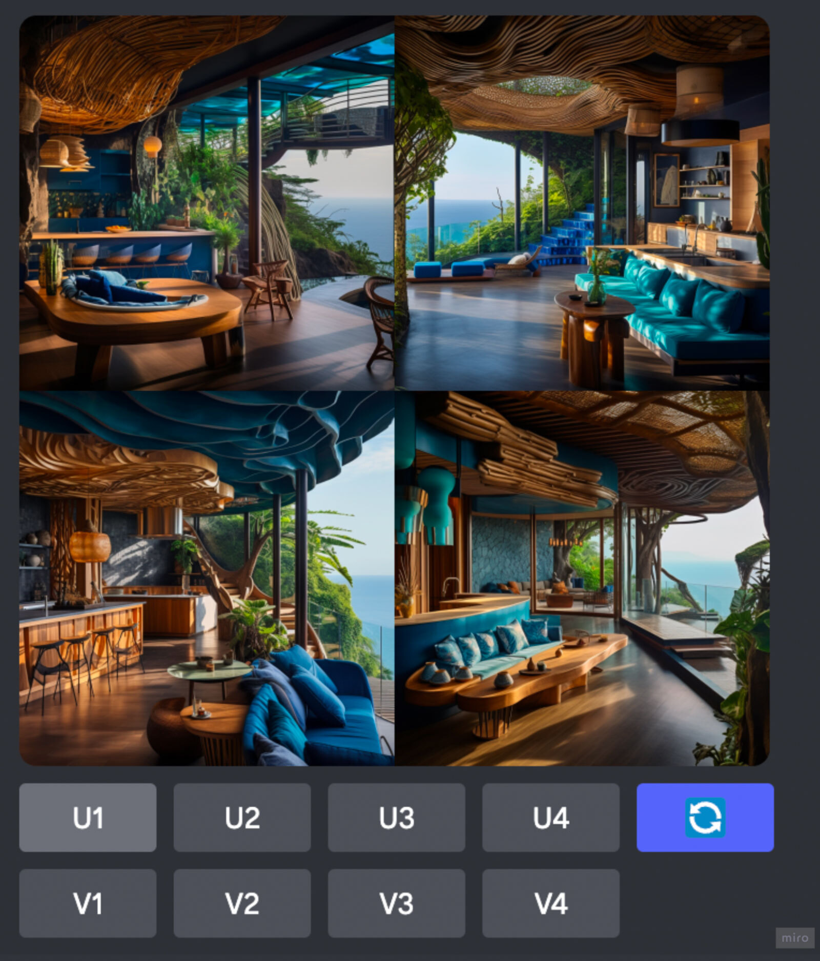 *Midjourney image output
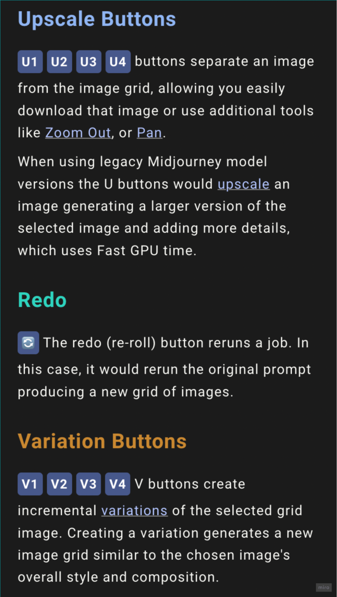
*Midjourney buttons manual
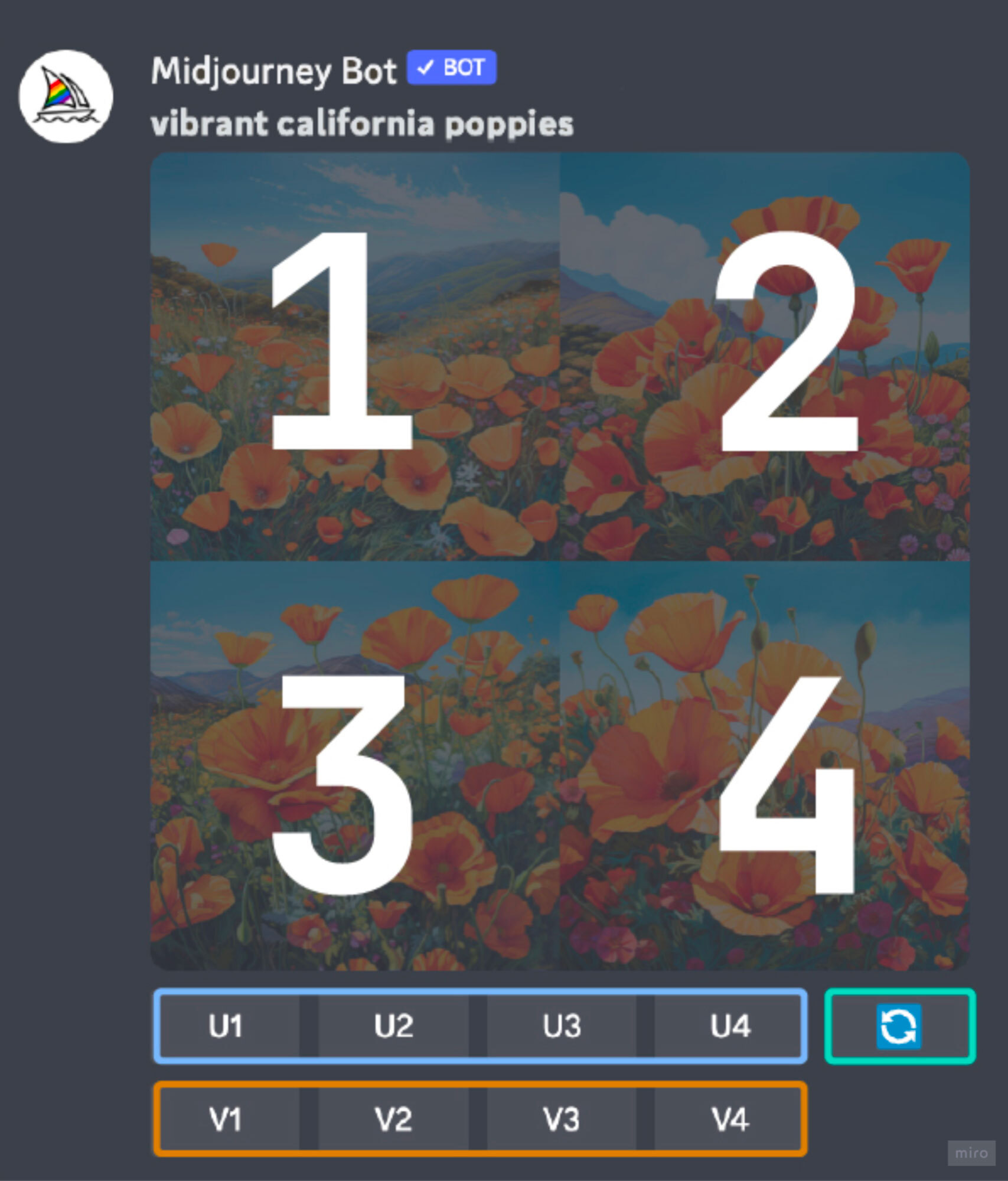
It also seems ambiguous to understand what order the images are in from the grid.
 It would be helpful to make the buttons represent the same layout as the image grid that sits above it. For example, it could be done like this:
 Also, if a hover effect was introduced and a tooltip it would dispel any confusion like the below mock-up:
 AI in the wild
AI messaging is popping up in unexpected yet useful ways across products.
For example Amazon have introduced a help summary of reviews for products, to give the shopper a quick flavour of how customers feel about the products.
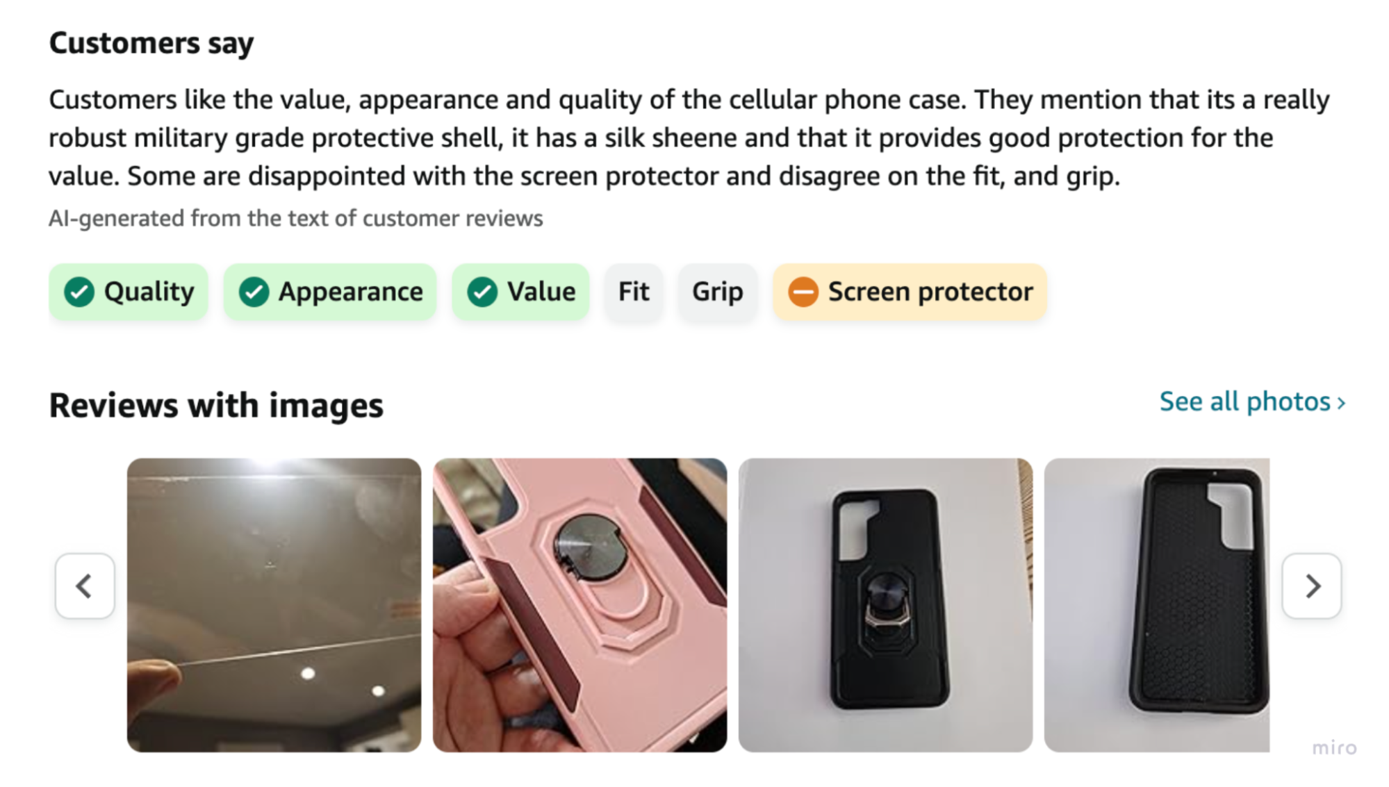
*Amazon.com January 2024
I wonder how long it will be until other products like Tripadvisor and the like follow suit. Will the future of these summaries be able to have a tone of the brand as well? For instance JustEat should have a different tone to Booking.com. AI should match their brand voice whilst also reflecting what the customers are commenting.
Another useful place AI is popping up is in the customising print sector. Sites such as Streetshirts.co.uk have included AI technology to allow customers to create an innovative way to add imagery to their products.
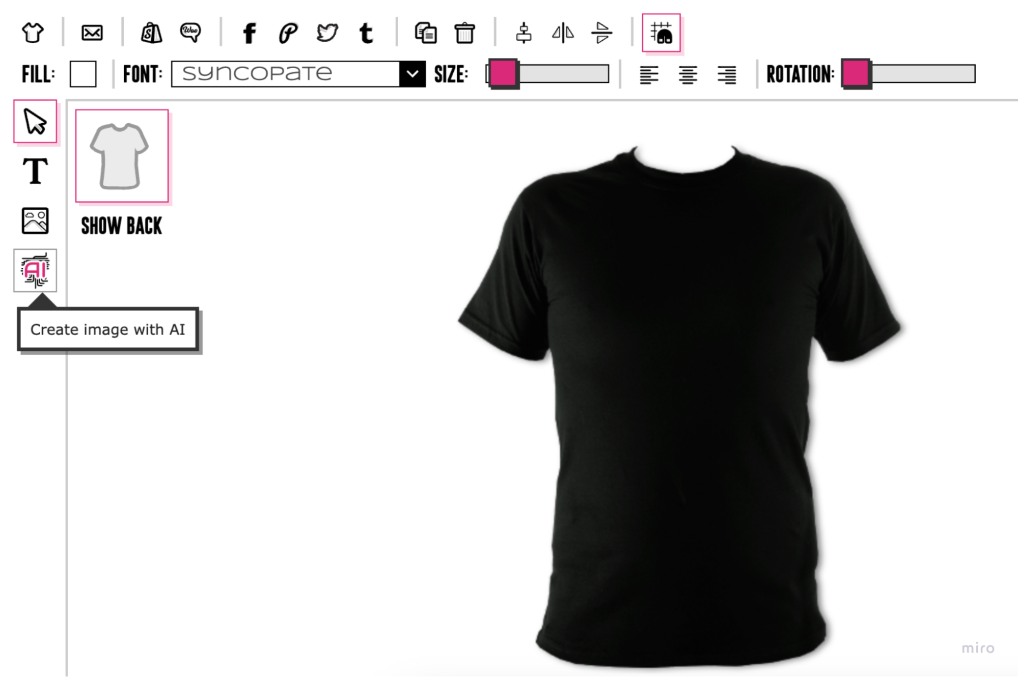
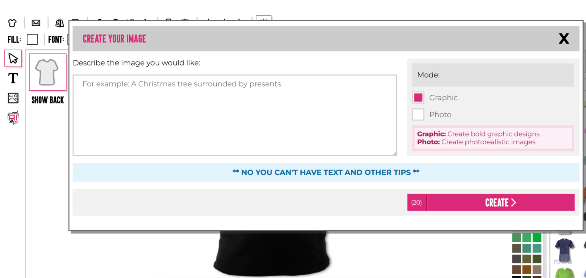
The UI could be a little more sophisticated in terms of the microcopy and layouts.
On the right section we have ‘Mode’ which has a checkbox but should be a radio button toggle because you can only select one option. Having a key under this is overkill and could be easily explained within the radio button itself.
One of the most dominant bits of content is a negative piece of information. “**No you can’t have text and other tips**” I assum this is a frustration that keeps occurring with users. But there would be a more elegant way to divulge this information.
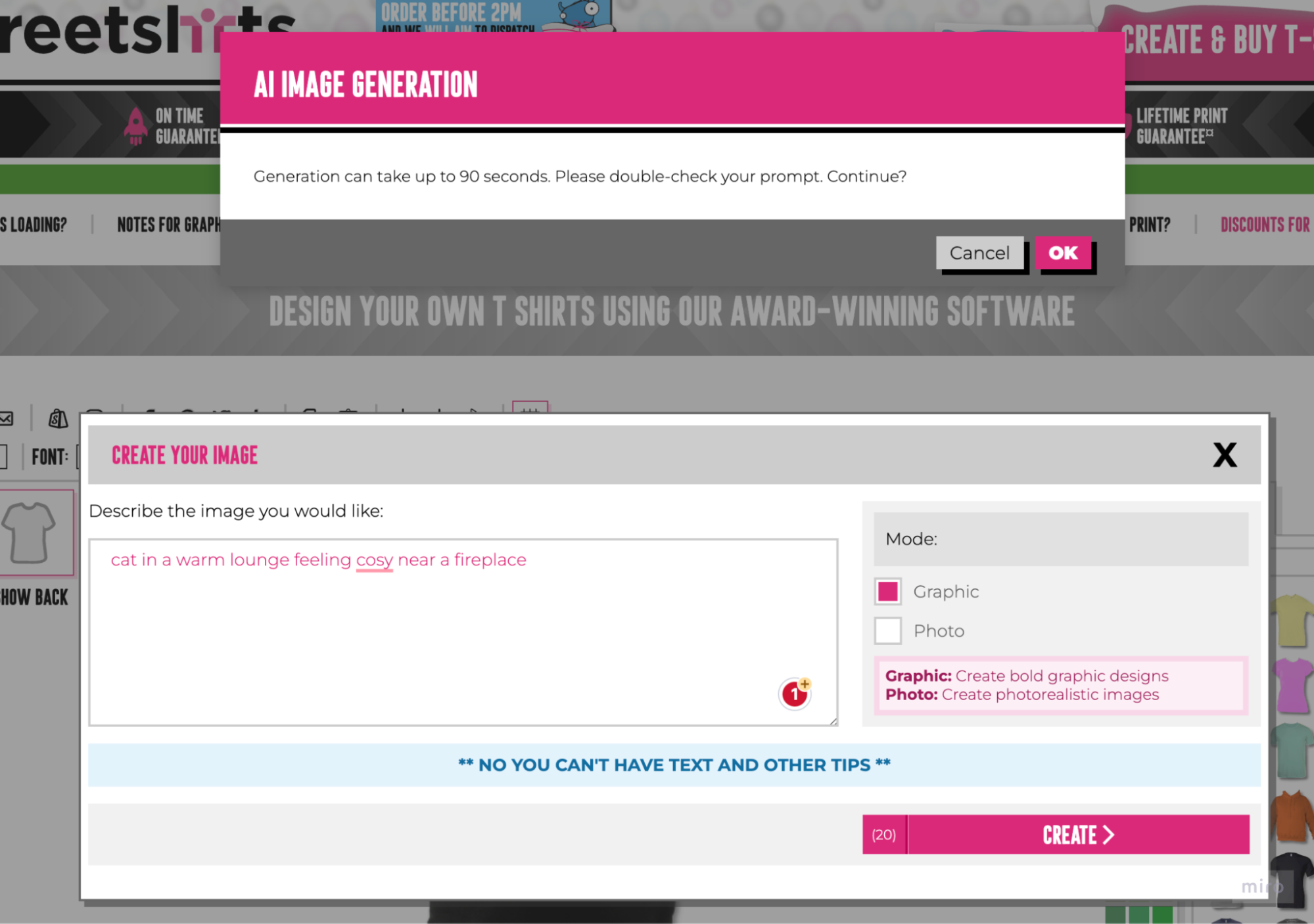
At the next stage we have this awkward notification message with two call to actions, whilst still being able to see the original modal:
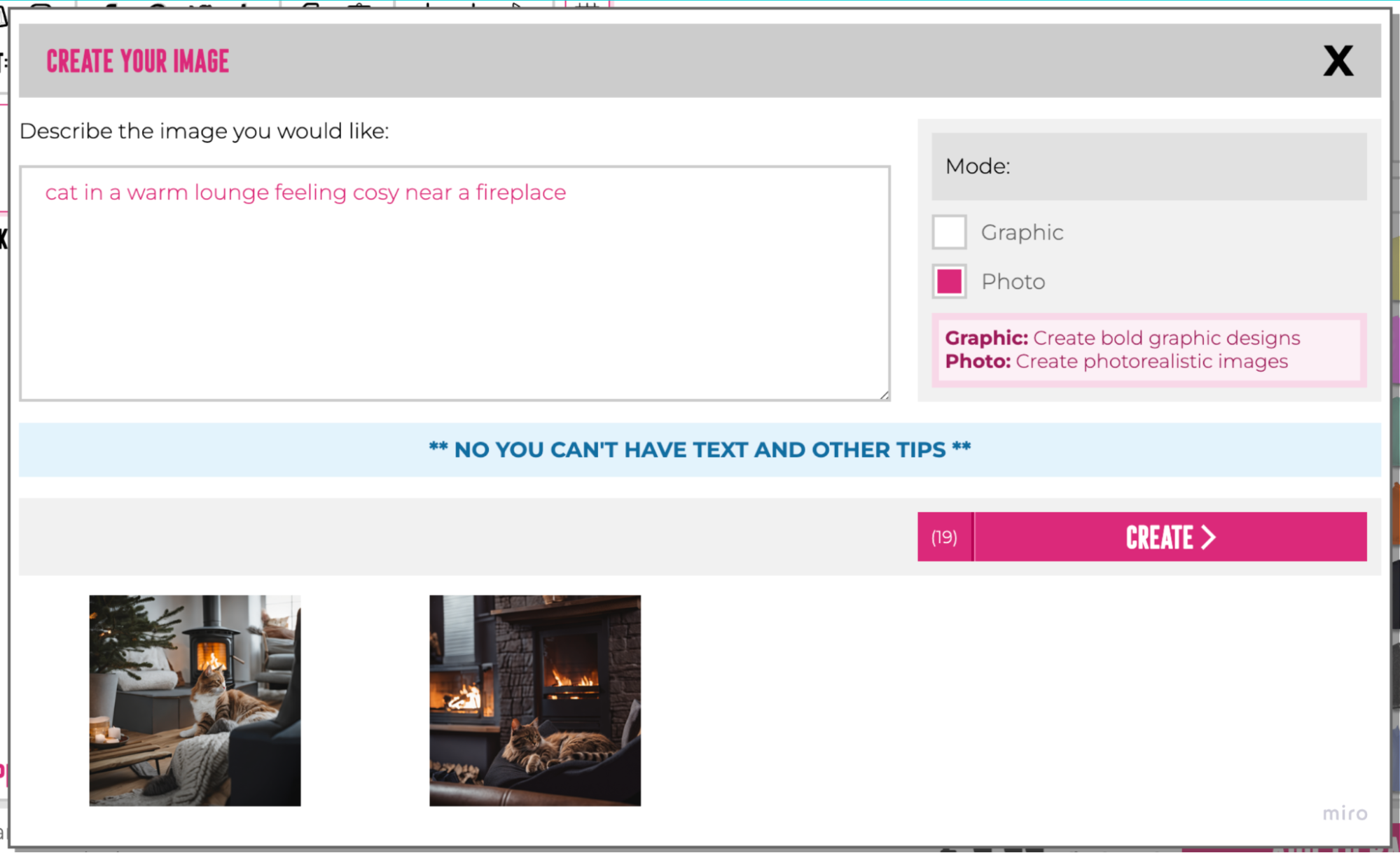
 And once the images have been rendered there is no prompt to suggest what the user to should do next:
AI is astonishingly powerful and is helping with efficiencies of time and creativity. But without quality controlling the UX throughout the customer journey, products are risking weighting themelseves too close to early adopters and losing the less tech savvy people.
This validates nervous users who don’t want too persevere with teething problems. Because why would they let themselves get frustrated and waste their time on a product that’s meant to be making their life more efficient.