This can be particularly frustrating when trying to view online content in areas with low bandwith. Think of a typical train journey and the amount of times the signal is poor.
For Publishers, page load times tend to be slow because of:
– Heavy weight pages containing large file sizes
– Too much content
– Responsive page design that pulls the same content as the desktop web page and aligns it vertically to fit the screen. Having a responsive design alone is not the answer.
Ads may also not appear on the webpage affecting viewability, revenue income from advertisers, and publisher brand safety. During a test we completed using a well-known newspaper publisher, it took 24 seconds for the first ad to appear due to the volume of content the site was trying to display at the same time.
Research shows that after seeing mobile ads 50% of consumers will: buy the product, search the brand online, talk about the ad, recommend it to others or take other brand related actions IAB mobile handbook, Katharine Hansford, Mobile Strategy & Development Manager, Publicis Media
51Degrees presented at a Mobile Marketer – Programmatic for Publishers Summit earlier this year.
During the roundtable sessions, James Rosewell shared how to do a simple health check on a website to see what content could be slowing the site down.
Note: This is not a substitution for proper testing on real devices and is not going to emulate a weak device with a low power CPU, but is good enough for your macro level analysis.
Step 1 – Using Chrome, open the website page or URL in question
Step 2 – Inspect Element. There are a number of ways of getting to the ‘Inspect element’ section:
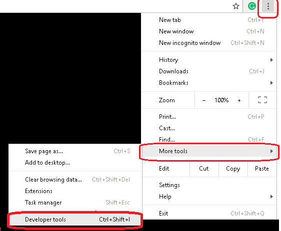
1. At the top of the page on the right hand-side click on the ellipsis menu (3 little dots) and click on ‘More tools’, then ‘Developer tools’.
2. Or, right click anywhere on the page and choose ‘Inspect’
3. Or, simply click F12 with the page open.

Step 3 – Go to the ‘Network’ tab
Step 4 – Choose the mobile conditions you want to emulate.
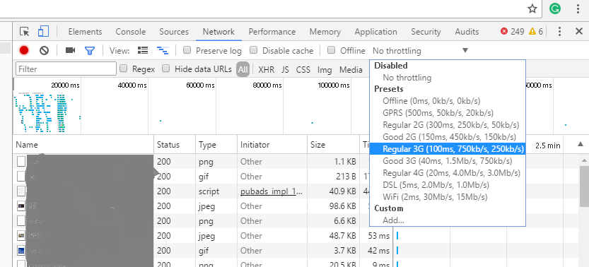
1. Disable caching to simulate a first impression/new user experience of visiting a website.
2. Choose the appropriate throttling/data transfer option to simulate the type of mobile network speed you want to test.
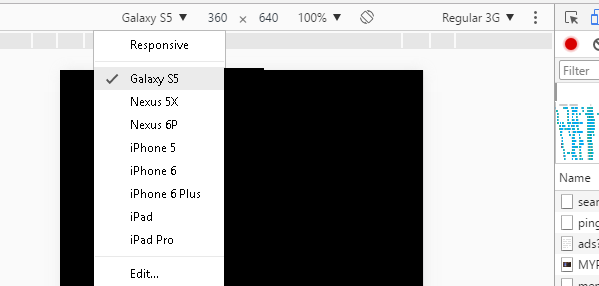
3. Choose device
Tip: Leverage Offcom information for checking typical mobile bandwidth for the areas you are interested in emulating and use those conditions as it won’t be as good as your office. The test will then introduce a bit of latency like the real non-office environment. Think of your typical train journey – where do you usually lose a good signal?
Note: This test does not take into account mobile battery power or power saving modes. Often when loading heavy webpages, phones in power saver modes, will go into standby after a few seconds, slowing web page load times even further as the connection gets interrupted. This may cause information that is partially loaded to fail and appear blank, or force a reload of the content, increasing the load time of the page even more.


Note: This only checks screen size. If you were to use device detection with your website analytics you would get hundreds more properties about the mobile devices visiting your website like price, operating system and device age to name but a few.
Step 5 – Check the individual elements that show as larger file sizes (see size column) which can cause pages to be slow to load.
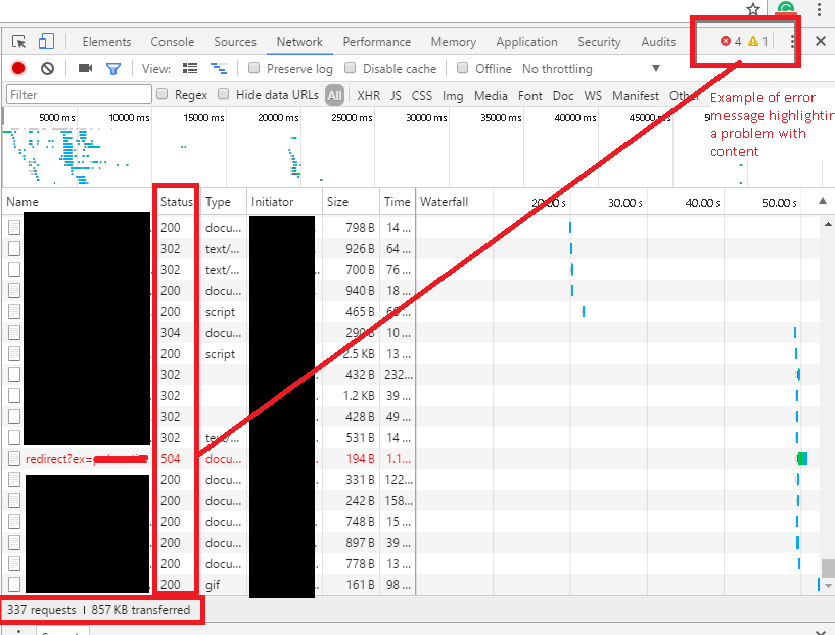
Step 6 – Check the bottom of the screen to see the total number of requests or ‘things’ the site is trying to load at once and their total size.
In the ‘status code’ column check the numbers displayed. Ideally, it should be between 200 – 300. Anything showing 400 – 500 or above is a problem.
You can also see at the top right hand side any errors that are flagged and these will appear in red in the individual rows of items the site is trying to load.

Establish whether it is critical for a mobile device user to see all of that content. This where device detection can be valuable as you can use the data to make those strategic decisions.
Once you have run this test you might consider using a more adaptive approach leveraging device detection and a server side content delivery instead of a purely responsive design. AdTech companies are realising they need to move to server-side process for Header bidding for example.
Using responsive design alone, the mobile device sends a request to view a website page and the website sends back all of the content at once resulting in slow page load speeds.
An adaptive design leveraging device detection, enables the decision earlier at the server side, about what critical content should be displayed on the mobile device identified. This results in faster page loading, better user experience and better viewability on mobile devices.
Adaptive design is not and should not be considered ‘extra’ work, nor is it bad for SEO. The benefit of applying an adaptive approach is you are shifting the logic and making the decision earlier in the process. This technique is advocated by Google AMP launched in October 2015 to address this issue.
Publishers around the world use the mobile web to reach these readers, but the experience can often leave a lot to be desired. Every time a webpage takes too long to load, they lose a reader—and the opportunity to earn revenue through advertising or subscriptions
Remember though, you do not need Google AMP to execute a mobile strategy or adaptive design. You can do it yourself. The main concern with using Google AMP is that you lose control of the content. If you do it yourself you retain control.
Our clients have seen immediate improvements using device detection, adaptive design and server side content delivery. Why not try it yourself for free.